
An internal supervision platform for electric service request management
Redesigning power supply system
Overview
When a customer applies for a new electric connection — opening a factory, moving into a new home — they enter a lengthy multi-stage process with regulated deadlines at every step. If any stage runs over, the customer waits longer, and the utility faces complaints and penalties.
GridWatch is an internal command platform that helps power supply dispatchers monitor time-sensitive connection requests, escalate to the right person before deadlines are missed, and track every order from a single workspace.
Team
UX team
Business analyst
Project manager
My role
UX Designer
Duration
8 weeks
Tool
Figma
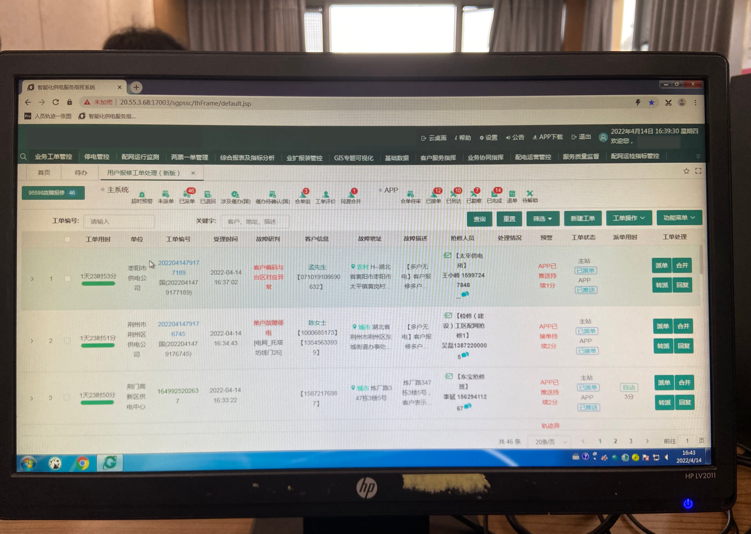
The old system
This is the environment our users worked in every day
— a dense, multi-tab interface spanning multiple systems, with no unified view of what was urgent or who was responsible.

"Every morning, I open three different systems just to figure out what's urgent today. And some orders I have to dispatch within 15 minutes of receiving them."
— Supply command dispatcher, user research session
Understanding users
The Dispatcher (my focus)
She sits at a desktop PC all day, toggling between the command system and the marketing system to piece together one work order's status.
Her daily responsibilities: supervising field staff, conducting follow-up visits, writing weekly reports. She manually tracks which orders are approaching their deadlines, dispatches escalations to departments (not people), and has no way to see if anything was actually resolved.

The Field Service Representative
He works mostly on his phone, outdoors, handling on-site connection requests. When a supervision order arrives, he needs to respond quickly — but the process is clunky, replies take time, and he has no clear view of where his orders stand in the overall process.

Pain points

Simple
Intuitive
Efficient
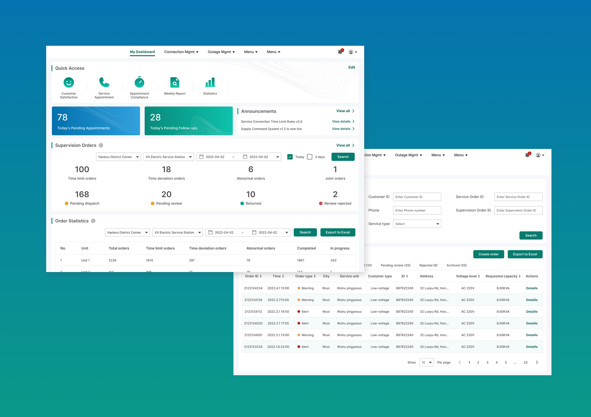
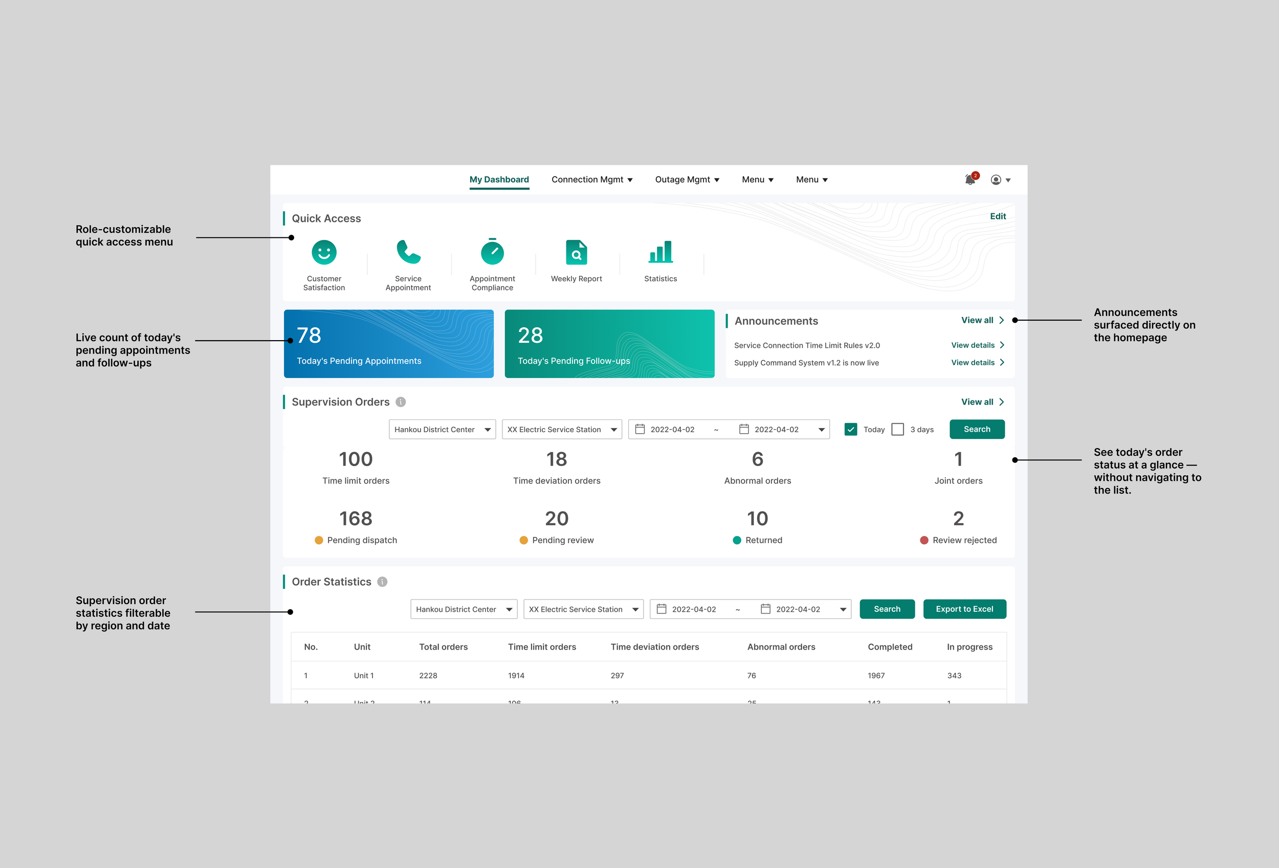
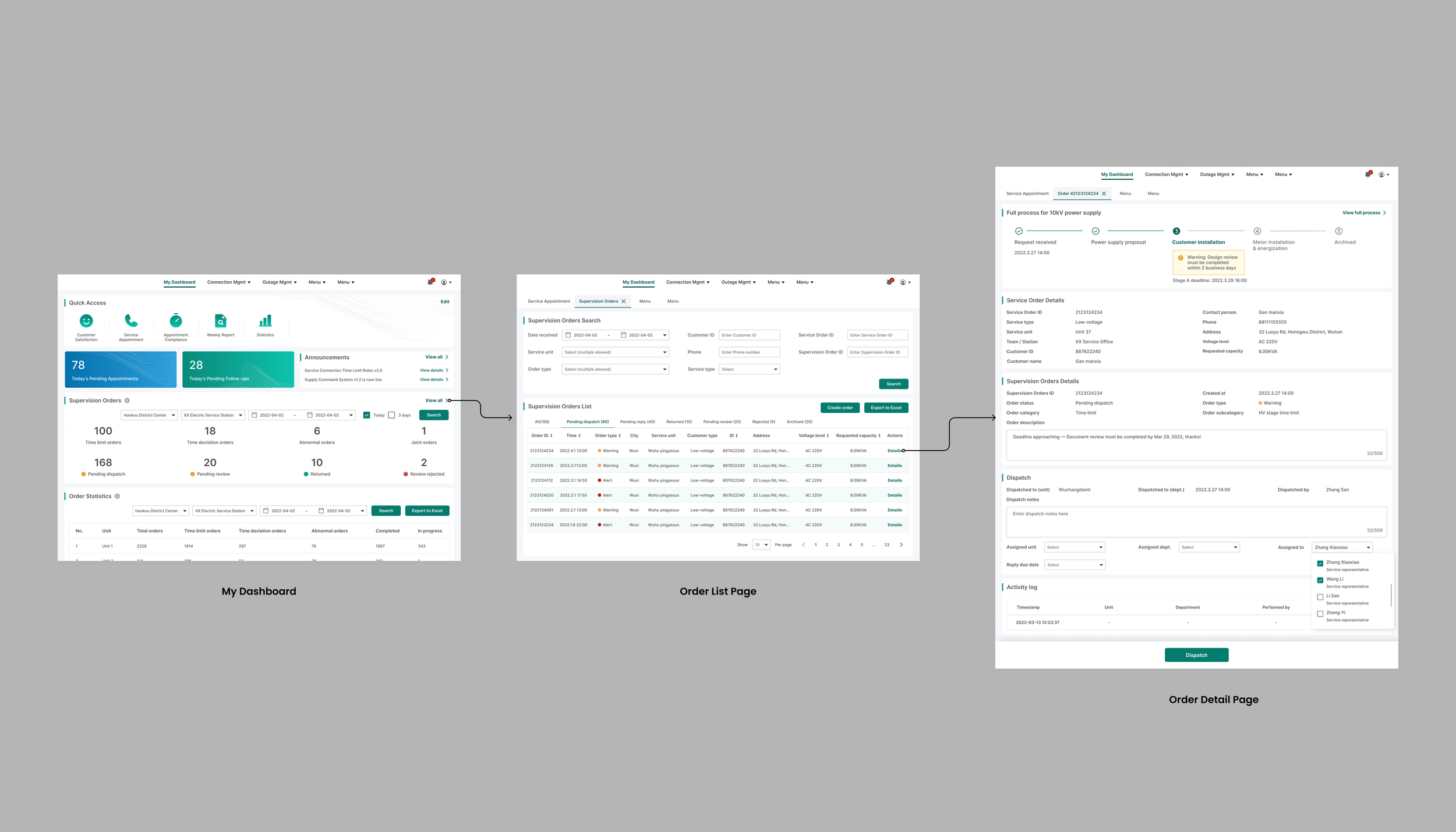
My Dashboard —
"Know what matters the moment you log in"
The old system buried everything. There was no overview of today's workload, announcements were hidden deep in navigation, and every user saw the same generic homepage regardless of their role.
The problem this created: Dispatchers had to navigate into multiple pages just to understand what needed attention. In a job where some orders have a 15-minute dispatch window, every extra click costs time they don't have.
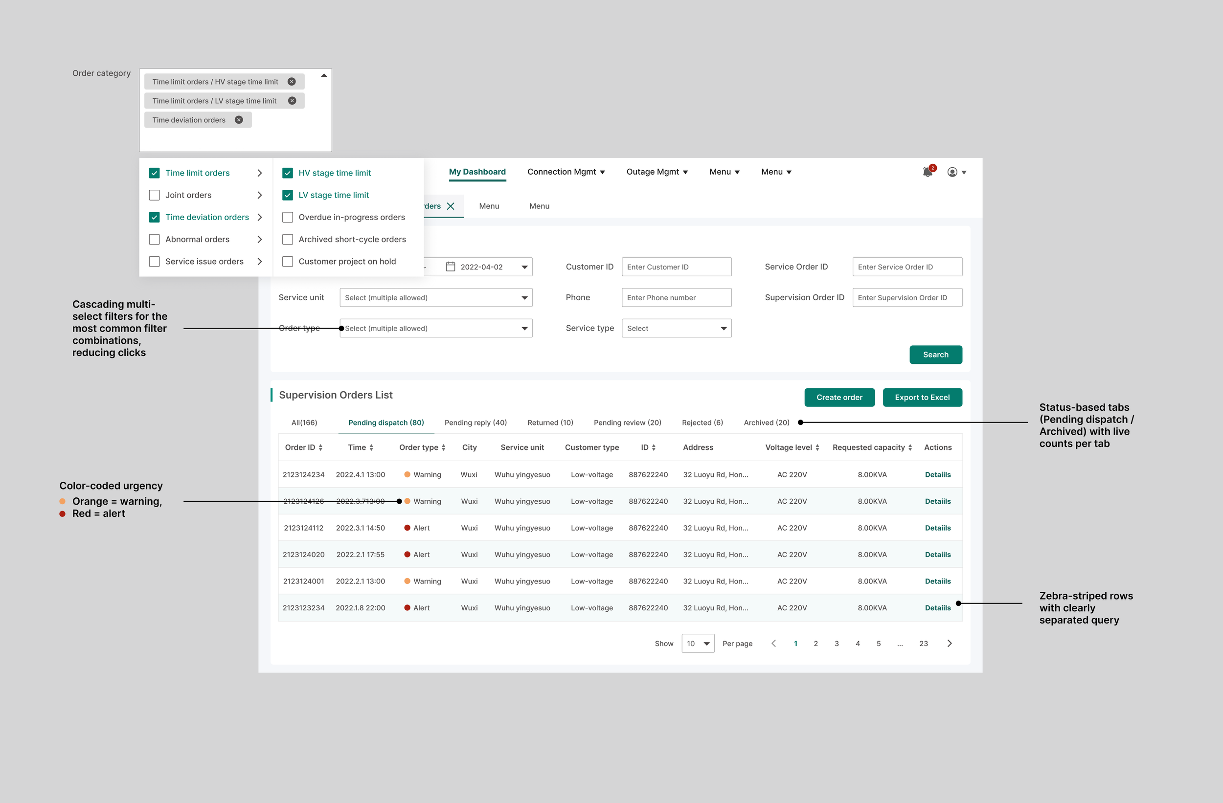
Order List Page—
"Priortize orders"
The old list mixed all order types together with no visual hierarchy. Finding urgent orders required reading every row — a serious problem when some orders had a 15-minute dispatch window.
The problem this created: With hundreds of active orders across the region, dispatchers spent valuable time just figuring out which orders needed attention first. In a high-pressure, multitasking environment, missed deadlines were inevitable.
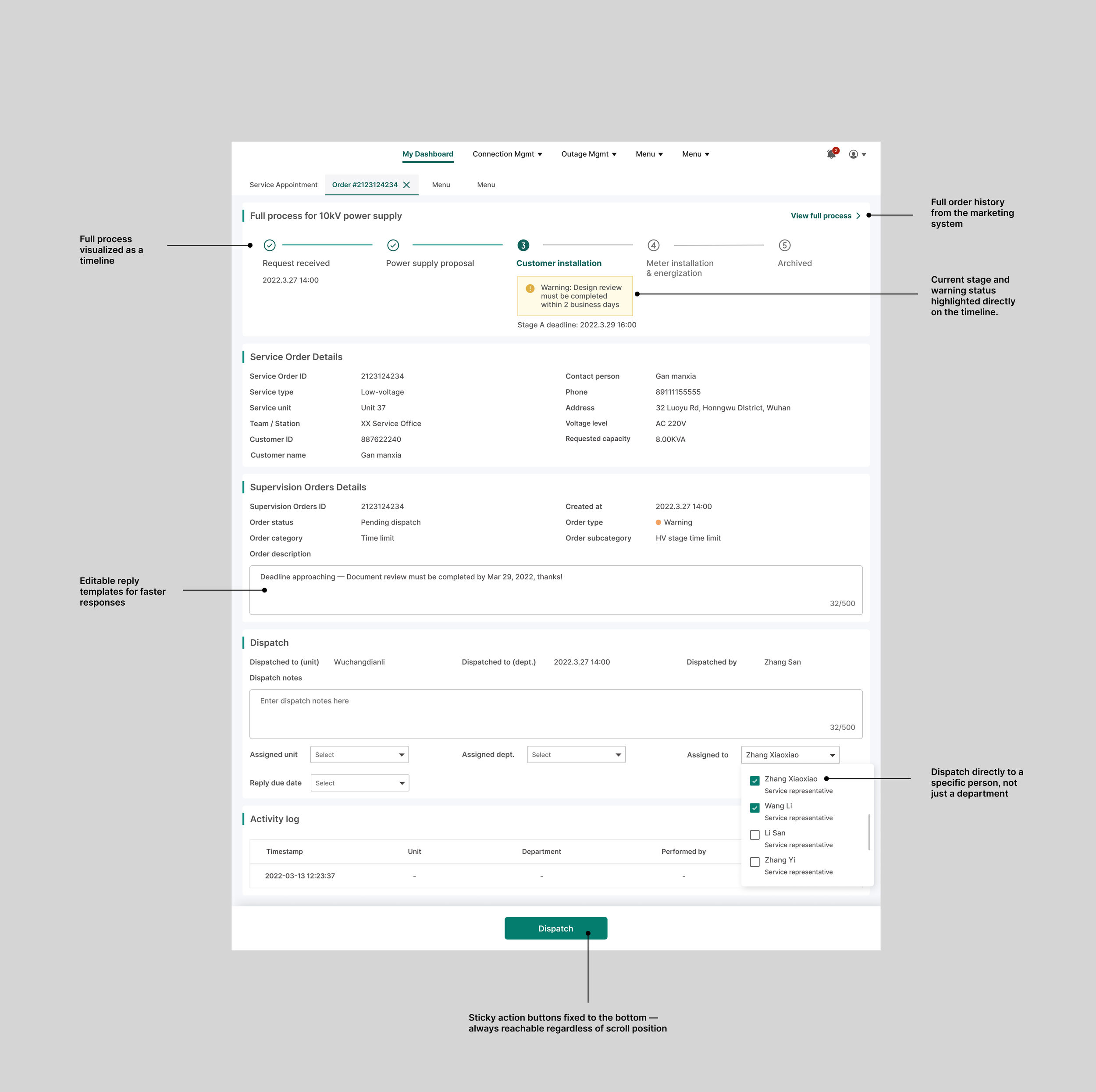
Order Detail Page—
"Everything you need to supervise, in one place"
This was the most complex screen and the most important design decision in the project.
The problem : To fully understand one order, dispatchers had to switch between two systems — the command system for supervision details and the marketing system for the connection order status. Time limit rules lived in a dense regulatory table that required manual calculation. And once a supervision order was dispatched, there was no reliable way to know if anything was actually resolved.
The process visualization timeline (the most important decision)
Process
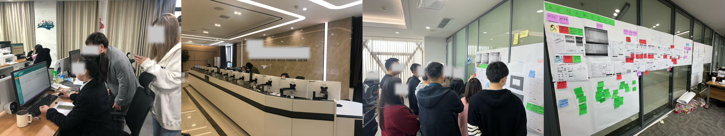
User interviews
On-site research
Validation with real users
Visual style exploration
Outcome
As a consulting engagement, development was handed off to the client's internal team. Post-launch metrics were not available to our team.
What the design delivered:
A dispatcher's core workflow went from 3 systems to 1 unified workspace
Time limit status went from manual calculation to visual timeline
Supervision went from department-level to person-level
Weekly reporting went from manual export to built-in statistics
What did i learn
The hardest UX problems in enterprise systems aren't about making things look cleaner. They're about making expert knowledge legible to the people who need to act on it.
The time limit visualization was the moment I understood this. A table of rules is correct but unusable. A timeline that tells you "this order will breach its deadline in 2 days" is the same information — made actionable.
Working in a high-pressure, multitasking environment also taught me that good enterprise UX isn't just about reducing steps — it's about reducing the cognitive load between steps. Every second a dispatcher spends figuring out what's urgent is a second she's not spending on the actual work.