
Redesigning Duunitori website for Low-Vision Accessibility
Designing for users with low vision, improving experience for everyone.

Hear the Project: Duunitori Redesign
Suomeksi
To make the project more accessible and inclusive, I created an audio narrative version that allows people to experience it through sound.
In English
Overview
Duunitori is one of Finland’s leading job search platforms, widely used by job seekers, including those with disabilities.
I chose Duunitori because of its popularity and social importance — as a key job search platform in Finland, improving its accessibility could have a real impact on a large number of users, especially people with visual impairments.
For this redesign, I prioritized users with low vision, as they represent a large portion of people with visual impairments. My research included an accessibility audit, user interviews, and testing with accessibility simulators, which revealed several critical barriers: low color contrast, inconsistent keyboard navigation, buttons not read correctly by screen readers, and pages without proper headings.
Guided by WCAG 2.1 Level AA standards, I redesigned Duunitori’s interface and integrated accessibility principles directly into the design system — including color contrast, keyboard navigation, focus states, component interaction patterns, and semantic annotations — to ensure the improvements are consistent, scalable, and easy to maintain across the product.
Team
Solo project
My role
Accessibility audit
User interview
Design
Duration
3 weeks
Tool
Figma
Axe Devtools Pro (Automated audit)
Silktide (Accessibility simulator)
Webaim(color contrast)

Motivation
While studying accessibility and inclusive design principles — both through my university coursework and additional Udemy courses — I wanted to apply these theories in a real, meaningful context. Job search platforms are essential tools that everyone relies on, yet many still create barriers for people with low vision or other visual challenges.
Through this project, I aimed to redesign a job portal that not only meets WCAG standards but also demonstrates how accessible design can benefit a wider audience. My goal was to make the job search experience more inclusive, clear, and usable for everyone.
Scope

People with low Vision:
Improve readability with larger text, clear hierarchy, and stronger color contrast. Replace color-only cues with text or icons, and offer high-contrast or simplified viewing modes.
Broader Accessibility:
Enhance keyboard navigation and focus visibility, and improve screen reader support across interactive elements.
Goal:
Enable all users—especially those with low vision—to easily find and understand job information on the homepage, job listing, and job details pages.

How might we make the Duunitori job search experience fully perceivable, understandable, and operable for all users, including those with low vision or using assistive technologies?

Before

After

Solution
System-level Redesign

While reviewing the interface, I noticed a few accessibility issues—low text contrast, confusing keyboard navigation, and missing semantic information for some components.
Instead of just fixing each issue individually, I took a step back and redefined the design system to make the improvements consistent and scalable.
I set up a clear color hierarchy to meet WCAG 2.1 AA standards, standardized keyboard focus and component states for smoother navigation, and provided ARIA label and role recommendations for the development team.
Even though I couldn’t test these changes with assistive technologies at this stage, this system-level approach ensures accessibility is built into the product and can be maintained across future updates.
Design system
In this design system, I consolidated key accessibility rules—
Color and Contrast
Keyboard navigation
Component & interaction rules
Semantic Structure & ARIA
— so that the improvements are consistent, scalable, and easy to maintain across the product.


Accessibility enhancements
Simulator: Glare mode

Some users, especially those with low vision or photophobia, are sensitive to bright screens, high contrast, or harsh glare. This can make reading and navigating websites uncomfortable or even painful.


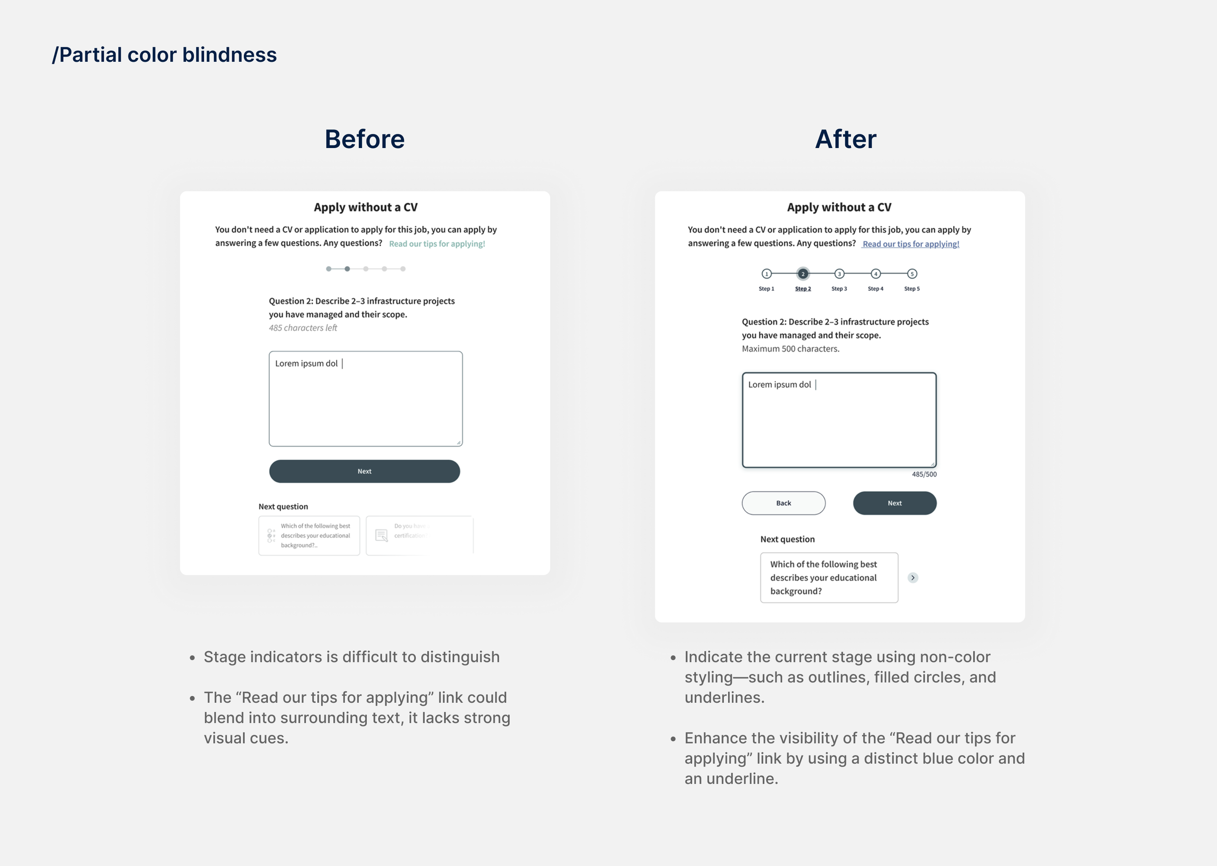
Simulator: Color blindness

Color vision deficiencies, or color blindness, affect how users perceive colors on websites. The most common types are:
Red-green color blindness (difficulty distinguishing red and green), blue-yellow color blindness (difficulty distinguishing blue and yellow), and total color blindness (unable to perceive colors). These conditions can make color-coded information, buttons, status indicators, and charts hard to interpret. To ensure accessibility, designers should avoid relying solely on color and use alternative cues such as text, shapes, icons, or patterns.

Simulator: Loss of central vision

Loss of central vision is a common visual impairment that affects a user’s ability to see details directly in front of them. It can make reading text, recognizing images or icons, and interacting with central interface elements such as buttons or form fields difficult. While peripheral vision remains, users may need to rely on layout cues, headings, or assistive technologies to navigate and understand content.

For screen readers

Screen readers can help users with vision impairments access websites, but they struggle when pages lack semantic HTML, proper labels, or logical structure. Missing headings, unlabeled controls, and inaccessible custom components make it hard to navigate, understand content, or interact with the site.

Actionable suggestions for the future
Short-term
Long-term
Simplify CV upload functionality: Drag-and-drop CV upload functions are difficult; “browse file” options or clear alternative instructions are preferred by screen readers.
Automated save features for applications/CVs: Job-seeking platforms should prioritize the inclusion of automated save features that are clearly visible and easy to navigate, particularly when submitting applications and uploading CVs or other supplementary materials.
Direct email links to modify applications: Users should be allowed to receive a direct link via email to modify their application, eliminating the need to search within the portal.
Clear instructions for application: Provide clear instructions for application requirements (such as CVs or supplementary materials) as well as clearly labeled links for where to apply.
Avoid color-only indicators for required/optional fields: Required/optional fields should not rely on color coding alone; text labels are necessary.
Broader user testing with diverse participants: Conduct broader user testing with individuals with diverse needs, including those with disabilities, provides real-world feedback on usability and effectiveness.
Ongoing engagement with feedback loops: Promote ongoing engagement with user testing participants through feedback loops, particularly after major site updates or development milestones.
Multi-modal instructions: Utilize multi-modal functionalities, such as video instructions, voice-to-text, and/or additional pictures, to ensure instructions for application forms and submission are accessible to different audiences.
What did i learn
Hands-On Learning
This was my first project focused on accessibility, and it gave me a deeper understanding that accessibility is more than just color contrast—it also requires technically correct implementation.
One thing I found particularly interesting is that what looks accessible may not actually be. For example, I didn’t realize that a label with white text didn’t meet WCAG standards until I checked it. This highlighted the importance of defining clear rules at the beginning of the design process, such as approved color combinations.
Accessibility is more than just a checklist
For this project, I focused primarily on the job application process within the Duunitori website, because in real-world scenarios, application forms are often hosted externally and vary by company, creating additional challenges. While audits helped identify technical accessibility issues, user interviews provided deeper insights into the real problems users face, such as navigating complex forms, understanding required fields, or encountering inconsistent layouts.
These insights informed my redesign decisions, guiding improvements in labeling, instructions, and overall form usability. This experience reinforced that accessibility is not just about meeting standards or checklists—it’s about understanding and addressing the real challenges users encounter in practice.